Monday 26 May 2014

Evaluation: FMP Dreams and Nightmares

For this I am going to write about my time whilst on my FMP (Final Major Project), the theme I have been looking at Dreams and Nightmares. I took my inspiration from my recent trip to Paris, whilst in Paris I visited a museum called Les Art Decoratifs in the time I was in the museum there was section about nightmares which really captured my eye. Everything I was looking at really intrigued me and I became really interested with the idea of using dreams and nightmares for my FMP so whilst there I took photos for my primary research. When I came home I started to research more into dreams and nightmares but I also widened my range to things like fantasy art all the way to Tibetan art. I chose to look at these types of things as the artwork and designs were very dreamy but also quite disturbing and dark.

When finally starting my FMP I undertook more research into my development from just the topic dreams and nightmares. Already I had decided on elements that I would like to have taken forward into my sheet work. The main design element that I took through all my sheet work is my Tibetan clouds as they were very dreamy and light, also another feature I took through was my sun and moon design as they very angelic designs and I thought they would look very pretty on my garment.

From the start of my project I have also been quite unsure what I was hoping to create/design for my final piece, I went through quite a few ideas of things like I would have liked to have made like: pyjama’s, a wall hanging, pillows and my final design that I settled with a dressing gown. Whilst planning to make my dressing gown a lot of constraints popped up along the way, money was one huge constraint for me, I was hoping to have made my dressing gown out of silk but with the cost of £5 per metre and me need 5 and a half metres of fabric I simply could not afford it, so I settled for a cheaper fabric which cost me less than half the price it would have cost me for silk.  

For experimentation during my project I tried doing patchwork, wading, weaving, needle felting and screen printing, but whilst doing my screen printing I had forgotten to tape the edge of screens up so when it came to printing pigment would spill through the edges and go onto my prints. Another thing I had to problem solve with was that when I started printing onto silk it would move and slip around a lot even though I would tape the whole piece of fabric down to the table, this was another reason that I changed my fabric for my final piece from silk to cotton, the result won’t be as nice but the quality of print will be a lot better.

Time constraint is a huge thing whilst I was doing my project which means there is certain things that I didn’t do or I have missed out on doing, for example if I was to have a little more time I probably would have embellished into some of my prints/samples and even though I have produced up to 20 samples I think I could have produced more to show different techniques and styles. For my artists I chose to look at Su Blackwell (paper artist) and Mister Finch (textile artist), Mister Finch looked at fantasy/fairy tale like creatures and creations same for Su Blackwell she also looked at fantasy but made all of her pieces completely out of paper and old books cutting and carving into the pages to create beautiful master pieces.

Whilst midway through my FMP me and my class had a little meeting to discuss and show our work to each other with our teacher in training Joanne. I showed my work that I had produced so far and went through the basics of what I was hoping to produce and what my classmates thought might be best to improve my work and what I could possibly make for my final piece and this is another place where I got my idea to create a dressing gown as a lot of my peers suggested that I create sleepwear. There are many things that I would change about my FMP and time management is one of them, at the start of my project I was very confident and had a lot of ideas but as my project went further and further in I found myself focusing on more things than others. For example my sketchbook was very neglected during my time as I was trying to concentrate more on my sheets because in previous projects I felt that my sheet work was quite poor.


Overall on my FMP I have used my blog very effectively and putting more stuff on my blog than usual in previous projects, my satisfaction with myself during my time has been half and half, there are strengths that I have produced like; samples, sheet work and my business cards and improvements are defiantly Unit 10 and sketchbook. If had another chance at doing my project again I would probably try and keep my motivation levels up like I did at the beginning of the project and my motivation just started to lack, if I would have kept it up I recon I could have produced better work in my sketchbook, finish my Unit 10 and produce my 3 missing sheets. 

Sunday 25 May 2014

Corporate business cards

Here are my finished corporate business cards, I have produced 30 all together as people will be hopefully taking them at my exhbition.


Creating my creative business cards

For my creative business cards I have chosen my sun and moon design, I have been to repographics and had my design transferred onto heat transfer paper, I have also had to details transferred onto heat transfer aswell.

I have then taken some fabric and my heat transfer paper and placed it onto the heat press for 18 seconds and quickly removed it, the only problem is its ridiculously hot and hurts your fingers a little.

I have then taken my two pieces of fabric turned them inside out stitched around the edge but leave about gap so I can turn it back through so its the right way again. After turning it back through the right way I have added my wading into it.

I have then sewn up the whole and here I have a finished creative business card, these cards will be in exhibition.


Development Sheets

These are my development sheets thats I have produced from my visual sheets.


Thursday 24 April 2014

So whats left to do?

So far during my FMP I have created mood boards, visual sheets and made a start on my sketchbook and experimentation, but what else have I got left to do?

My sketchbook needs work, a lot of work and I am currently working on my first develepment sheet and hopefully when I go back to college on Monday I will only have little bits and bobs to do on my second development sheet. When I get back I will make a start on my tracing, buy fabrics and start to dye them up ready for when my screen is ready and finished.

In my spare time whilst i'm not at college I will work on my sketchbook at home and work on creating two possibly three artist research sheets.

Visual Sheets

From my mood boards I have now produce two visual sheets which consist of dream symbols and inspiration took from photos on my mood boards.
All of these sheets have been painted with gouache paints and I will now produce my development sheets from these.


Needle Felting

Over the Easter holidays I took home a variety of things to do and keep me occupied, I have taken some needle felting things home and I have created this sun and moon.

This is what it looked like in mid process.


There is still work to be done on it and I post a picture of the finished product when finished soon!

Mood Boards

Here are my two mood boards that I have produced with images found of the internet that relate well with my FMP, in these two mood boards I have used certain subjects like: mythology, fantasy, nightmare art, tarot cards, Tibetan art (the clouds) and a dream symbol sheet to show what the most seen things are that people visualize in dreams and nightmares.
From this dream symbol sheet and my mood boards I will produce visual sheets.


Thursday 3 April 2014

Getting Creative

On my day off from college I decided to make these cute little potion bottles that I think fit perfectly with my FMP ideas, I will be giving them weird and wacky names as they are supposed to be potions. I would like to put them in with my exhibition and hopefully sell them with the rest of my work that I will be displaying/selling. If my textiles tutor likes the idea of these I will produce more over the Easter holidays.

Sunday 23 March 2014

Professional Practice: Business Cards

During my time doing my FMP I will have to make business cards at some point so that when I have exhibition at the end of this project if people wish to purchase items that I have made then they can pick up a business card with my details on to get in contact with me about payments and possibly if they could have some make larger etc.

So I have started looking at good and bad business cards to take inspiration from and not what to do when making my own.
These are some business cards that my tutors class last year produced and a few a some that she has just picked up when being out and about places.


These are examples of good business cards, they are all very different, imaginative
 and aren't like normal typical business cards you can tell that quite a bit of though have been put into these business cards. The day of the dead skull is quilted like a pillow which has been make with heat transfer, another two methods that has been used on one of these cards is screen printing and  one of them have been hand made out of wood.


These business cards are bad examples as things have been done like: edges haven't been cut straight, shoddy handwriting that cannot be read, same with another one a word font has been used that can't be read and they just haven't been imaginative with their designing with the cards. They just look unappealing an very boring.

Friday 21 March 2014

Final Major Project: Dreams and Nightmares

For my final major project I have decided to research/look at Dreams and Nightmares, I took inspiration for it from my recent trip to Paris when visiting Les Art Decoratifs, whilst in the museum there was a exhibition to do with nightmares and symbolism which was full of weird and wacky pieces of work that were based around visions of nightmares. Therefore with me being interested at the time I decided to take plenty of photos for primary research just in case I was definitely sure that I wanted to do this subject for my FMP.

I will be questioning what Dreams and Nightmares are and looking into dream dictionaries, tarot card reading and things that can happen whilst you sleep like lucid dreams where you can control your dreams (like an outer body experience) but sometimes lucid dreaming can be quite unnerving and there have been occasions were people have heard and seen supernatural beings whilst lucid.

Along my line of research I will looking at mythology, fantasy, Tibetan art and a range of artists & designers, I have already chose a lot of artists and have started to think about creating artist research boards and pages in my sketchbook. Although I have a pretty good idea of my whole general theme that I have chose I still am unsure what I will produce as and end product.

Tuesday 11 March 2014

Evaluation: Live Brief Moo

For this I will be evaluating my Live Brief for a small local Boutique in my town called Moo, in this project brief we were asked to produce a range of A3 samples on marine invertebrates. So first thing to do like any other project was to collect primary research, for my primary research I firstly went to to the Moo shop to take photos of their garments that they produce and just get a general look at the shop I also went and visited the World Museum in Liverpool, I took photos in the aquarium part but unfortunately there was not a lot of marine creatures that were invertebrates but it was still primary research to work from. My secondary research were images from places like Pinterest, Tumblr etc.

From my research and images taken I produced mood, visual and development sheets from these I took certain elements from my sheets like my waves, tentacles, sea urchins and coral pieces, I chose these as I thought they all looked really good together and it looked very ocean like. Also from visiting the shop I took inspiration from some of the colours and the fabrics used , the clients from the shop had asked for the product to be designed for spring/summer in monochrome (black, white and grey) and one single colour of my choice, therefore I could not use a wide range of colours like I usually try to use in my work.

Even though throughout this I was only limited to monochrome and one colour I still tried a variety of different fabrics to show what my design would look like on thicker and different textured fabrics. Although when I tried using devore velvet which I found quite troublesome as when I came to use to devore paste it was very thick and wasn't a very good consistency to screen print with, so I had to pull it through the screen as hard as I could for it to print onto my velvet, after that the devore did not show up very well and some bits were missing completely which was really disappointing because I enjoy using devore and seeing the outcome. Also I experimented with satin which turned out lovely the feel and finish on it was better than I expected it to be, I would have tried alot of other different types of thicker fabrics but I didn't want to stray too far out of the brief and try and stick to lighter materials which were suitable for spring/summer, not only would you not want to be wearing thick clothing in spring/summer you also wouldn't want to be wearing very dark clothing which brings me to my next point. During summer or spring you don't want to be wearing darker type of clothing so I tried to make my colour very natural, light and quite pastel like, I would have liked to try a wider variety of colours but with the constrainst of it having to be monochrome and summery I had to limit my options. 

Whilst doing all of my processes I have looked into artists along the way that have inspired me, the first artist is Mariel Manuel her "Keep Your Eye On The Doughnut" collection was widely based on sealife/sea creatures she also uses light weight material as her collection is also based for spring/summer her patterns, colours and designs are beautiful and are very much how I imagine the people from Moo were looking for something similar to her designs. Another designer I looked at was Iris Van Herpen I was highly impressed by his crazy patterns and designs, he is a fabric manipulation designer and some of his work is so quirky which made me think that with this project it needed a little bit of quirkness/unique style as the product was going to Avant-Garde.

I took my final design from one of my development sheets as it look quite different and a little out there, I also thought it fitted the brief quite nicely with the colours I had picked and the design is a repeat pattern, my final piece is also very easy to reproduce as tracings are available for screens to be made but I already have screens made up, along side screens already been made up I have a recipe card for pigment inks to be easily made up without hassle or messing about. I have used different processes during this I have done a small weaving sample made out of non slip underlay for carpets, when woven together it looked very corally and I really liked the outcome out but it was quite difficult to do with it being quite thick and rubbery so pulling the sticks out was very hard to do. Fabric manipulation is also on the list I took a lesson to sit down and learn about how do it and it was a lot easier that I thought also it was very fun and I enjoy trying out new techniques, then finally and most obviously I did screen printing.

Throughout I've had my fair share of ups and downs my fabric manipulation was very well done and I found everything about it went quite smoothly. With the screen printing it had a lot of ups and downs first the bad part was that one of my screens was the opposite way round so after having to re-expose my screen everything went quite smoothly from that point on wards my screens lined up really well. Also as I mentioned earlier my devoring went quite badly and it didn't turn out as great as I wanted it to. Time mangement was very push and shove with this project as I missed a week with me going to London/Paris with college overall I think if I would have had that extra week there would have been certain things like put extra effort with my sketchbook as I feel that is defiantly the weakest sketchbook I have produced when in fact it should have been the best I have produced yet. On the plus side coming in on my days off to work in the print room have helped me out with my samples vastly, if I not have come in my days off then I wouldn't have found out the problem with my screen and I wouldn't have time to sort it out and my samples would have been catastrophically bad. 

Working with a diary has helped me out massively being able to document my progress and seeing what has been done and what needs to be done has encouraged me to work on things that need to be done on days off and the use of my diary has made me thing about buying/making one for my next project to keep on top of things. Also working with someone outside of college has been really different to thing that i'm actually producing something for someone instead of just doing it for a normal everyday college project it's been really nice thinking that at the end of this project someone is having there work made into a dress and is going to be sold. Overall satisfaction of this is that I could have done a lot better if I would have tried to get more work done in the time given and next time for my final major project I will take into consideration of creating a diary and giving myself tasks and deadlines and sitting down when I get home and telling/writing down what I need to do the next day and in my spare time concentrating on experimenting in my sketchbook and doodling and getting general ideas down. Making notes in there and writing a lot more annotation.  


Presentation

Yesterday Moo came in to see our final products and see what we had produced throughout this project, my presentation went quite well but I found myself getting a bit tongue tied and getting mixed up with words, they seemed to really like my work and seemed overall impressed by the standard of work produced. Joe and Danielle were the winners of the competition and will have there design made into an Avant-Garde dress. 
Well Done Guys!! 

Prints

These are a range of my samples that I produced in the print room and also presented to Moo, I picked these out as I feel that these are some of my strong prints. All of the colours were made and mixed by me and have been documented on a recipe sheet.


Produced on Light Cotton.
Non Dyed Background.
Printed with: Turquoise 4G, Navy Blue 5RF and Blue B.


Produced on Light Cotton.
Non Dyed Background.
Printed with: Turquoise 4G, Blue G3 and Grey BT.


Produced on Habotai Silk Heavy.
Non Dyed Background.
Printed with: Navy Blue 5RF, Grey BT and Turquoise 4G.


Produced on Habotai Silk Heavy.
Non Dyed Background.
Printed with: Turquoise 4G, Minerfoam B (puffbinder) and Grey BT.


Produced on Muslim Cream
Background dyed with Blue MXR watered down. Dried, washed, dried then pressed to make the colour not as dark.
Printed with: Navy Blue 5RF, Minerfoam B (puffbinder) and Black SN-G.


Produced on Habotai Silk Light
Background dyed with Blue MX2G and Blue MXR. Dried, washed, dried then pressed.
Printed with: Violet Blue 2BTL, Grey BT and Turquoise 4G.


Non Dyed Background
Printed with: Turquoise 4G, Black SN-G and Grey BT.


Produced on Habotai Silk Light
Background dyed with Turquoise MXG. Dried, washed, dried then pressed.
Printed with: Violet Blue 2BTL, Grey BT and Turquoise 4G.


London/Paris Trip

On the 3rd of February (my birthday!) I went on a college to trip to London and Paris, whilst in London we visited Camden Market which is way bigger than I expected it to be, I looked at loads of different stands and stalls but whilst I was there I didn't really buy anything but it was amazing to walk round and see all the different things that were on offer. Early next morning we got up and got on the road to get to the Euro-tunnel which was a really strange experience for me, after a really quick trip of just half an hour I was in Paris unfortunately we still had to travel up to 4 hours to get where I was staying. When I finally arrived there it was quite late and it was just all about sitting back and relaxing after a really long day of travelling, the next day we went shopping in Champs Elysee's and briefly visited the Arc De Triomphe it was so surreal and a stunningly beautiful place to be. The next day I visited the Les Art Decoratifs museum which was full of amazing textile clothing, furniture and other outstanding artwork, I took a lot of photos whilst there and picked up some ideas for my FMP, after looking round we then went to the Hard Rock Cafe for some dinner. On the final day we had to get on the Metro where we got separated off from the rest of our group and our tutors so we all had to look out for each other and get off at the right stop, we we emerged from the Metro we were at the foot of the Eiffel Tower which was breathtaking, I couldn't believe I was actually stood there staring at the Eiffel Tower, it was so surreal. We left the foot of the Eiffel Tower and went on a river cruise where on the cruise I learn't some interesting things about the Parisian culture after the river cruise we were at our final stop before we set off home at the Galeries Lafayette. I would love to go back to Paris one day as it was an amazing experience and the city was absolutely beautiful.


Sunday 26 January 2014

Mood Boards

This is my first mood board I have produced, I have took a previous drawing that I have done of an ocotopus and also added two pictures from textile designers: John Rhoda and Iris Van Herpen's dress designs which are ocean themed.


Sunday 19 January 2014

Live Brief: Moo

On Friday I was given a new project, we've been given a design brief from a shop in my town called Moo, they want me and the rest of my class to design a piece based around Invertebrate Sea Marine Creatures. This will be a competition and the person that wins will have they're piece made and sold in Moo.

Thursday 16 January 2014

Evaluation: Manmade VS Nature

This is my Evaluation for my Manmade VS Nature project I was unsure from the start whether I would look at Manmade or Nature.The first thing I needed to do like every other project was to buy a new sketchbook, as I didn't have much money at the time I decided to make my own sketchbook. After making a sketchbook I was informed to start collecting primary research as it vital when starting a new project, after starting this project I took photos of a set-up we did as part of our project, I also went to Sheffield for a shopping trip and whilst I was there I thought it would be a perfect time to take photos, I took photos of the buildings and some light fittings I had seen in a shop that looked very intricate.

After collecting my primary research images I decided to gather some secondary research, still unsure which path I should take with either Manmade or Nature I gathered images for both of theme, I also drew from the observational drawing we had in the middle of the room, I used a variety of different media for this like: chalk, ink and stick, white paint and drawing on an uneven surface whilst drawing the set up I moved around it so I had a different section to draw every time.

When doing my research I came across an artist called Patrick Dougherty and I found his work amazing, he would use crape myrtle tree cuttings, twigs and vines and create huge scaled pieces ranging up to 40 feet tall from looking at his work I thought that I would possibly look more into natural things. In my secondary research I had found photos of rust which made me think more about looking into metal things and already in my sketchbook there were images of clocks which then made me thing further and think about the cogs inside the clocks.

For my mood boards I did one on manmade and one on natural as I was still unsure, on my natural mood board I used leaves but over time they decayed, became dull and crispy which made it look a little weird over time but I still like it, on my manmade mood board I looked at lights at first but I also added some keys onto it. After doing my mood boards I started my visual sheets, I still was still unsure which theme to choose so I did one on each again. For my manmade I used keys and light bulbs that I had previously used on my mood board and after looking at clock cogs I decided to add those onto my sheet too I think they looked really good with the keys. For my natural I used the butterfly and drew some leaves I used on my previous sheet, I also drew some roses and feather onto it as I had a picture of roses on my mood board and I had drawn roses and feathers in my sketchbook. 

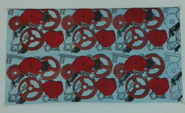
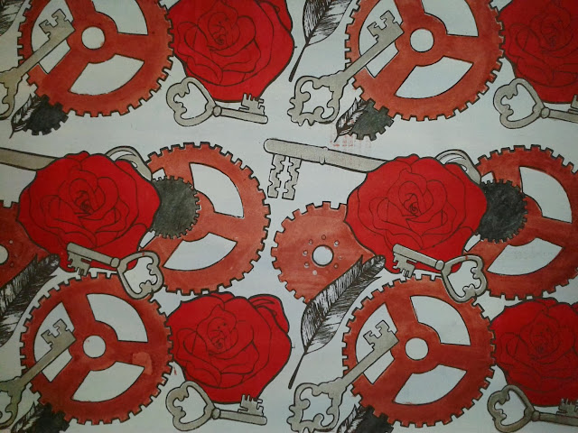
After sitting down and thinking I came up with the idea of combining manmade and natural together, I thought I would take my roses and feathers that were drawn on my visual sheets that are very subtle and delicate and then take something very heavy duty like my cogs and my old styled keys and combine the two together to show difference between the two. After finally deciding my combination of the two I then worked on my development sheets, I when on the internet and found patterns and images of leaves and roses and placed them inside my keys and cogs and on the other sheet vice versa.

During this project I have also learnt some more new textile techniques, I already knew how to wet felt but everything else like: weaving, knitting and needle felting were brand new to me. Knitting was the first thing on the list and I could not get to grips with it all to start off with, I could cast on and was hopeless at just knitting in general but now with a bit of practice I think I’m pretty good at it, they’re aren’t holes running through it from dropping stitches and I can now cast on and I’ve taught myself through YouTube how to cast off as well. Using the peg loom was my favourite thing as I loved creating different weaves and I would love to buy a peg loom and try and create my own blanket. Felting is the only thing I have done before I’m not a big fan of wet felting but I knew exactly what to do, after creating my felts I used them for needle felting I wish I had given myself more time to create a lot more needle felting samples as I enjoyed it, it’s something I’d use in the future.

Throughout this project I have had to problem solve and try and experiment a lot, in my samples I have used batik which I don’t really like using as its quite messy but it actually looks quite nice in some of my prints, a lot of my prints have puffbinder outline and I think it looks really nice. Whilst printing I’ve found out from trial and error to tape up my board to stop procion getting on my work. After creating my samples I got placed with two people and had to give a small presentation they then picked out 3 designs which they though could be combined together and worked into, after being told what would look best I did a sample and I think it is probably the best combination that they could have picked.

When going about my final piece I decided to get all of my outlines and roses done and then print my cogs and keys, as I explained earlier I had to restart my piece 3 times from forgetting to tape my screen up like the rest which set me back with time and resources. On my final print I had coloured all of my print and on the final print of my outline the screen moved and has doubled the image up and with me having no time left I had to leave it, I was going to cut it off but then I would not have a 1 metre wallpaper piece.

Time management during this project hasn’t been a huge issue and overall I think this project has gone better than I expected it go, my strengths have been managing 4 screens and working well to get my print done with so many screens but it’s just a shame my last print smudged. If I could do this project again and improve something it would definantly be my sketchbook.